Skip to Content
Subscribe
Log In
Menu
Search
Search
About
Contact Us
Tip Jar
Comment Policy
Advertise
Podcasts
OKC Bar Trivia, Singo & Bingo
Log In
Subscribe
The Lost Ogle X (formerly Twitter)
The Lost Ogle Facebook
The Lost Ogle Bluesky
The Lost Ogle Instagram
The Lost Ogle YouTube
Everything Else
Is this the Oklahoma City Thunder Logo?
By
Patrick
9:02 AM EDT on August 30, 2008
Share on Facebook
Share on X (formerly Twitter)
Share on Bluesky
Underwhelmed? I know I am.
Share on Facebook
Share on X (formerly Twitter)
Share on Bluesky
Patrick
Patrick is the founder, editor and publisher of The Lost Ogle.
Read More:
Membership
,
Oklahoma City Thunder
Stay in touch
Sign up for our free newsletter
Email
Sign Up
More Stories
Everything Else
TLO’s Top 26 Stories of 2026… so far! [Part II]
Beth
July 2, 2026
Everything Else
TLO’s Top 26 Stories of 2026… so far! [Part I]
Beth
July 1, 2026
Politics
OHP Bodyguard Put in Charge of I.C.E…
2
Comments
Patrick
June 30, 2026
Arts & Culture
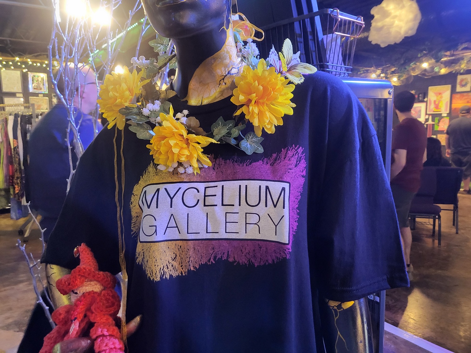
Artful Subversion: The All Trans Art Show at Mycelium Gallery
Louis Fowler
June 30, 2026
Politics
Ryan Walters Celebrates New Texas Bible-Study Mandate…
8
Comments
Patrick
June 29, 2026
Politics
Markwayne Argues With Purply-Haired Congresswoman…
6
Comments
Patrick
June 26, 2026