

Sorry about the lack of blog posts today. I'm recovering from the time change and last night's disappointing True Detective finale. Plus, it's 72-degrees and sunny outside with hardly any wind. We get about 10 days like this a year. Why would I want to write free stuff for you when I can be drinking mojitos on a patio?
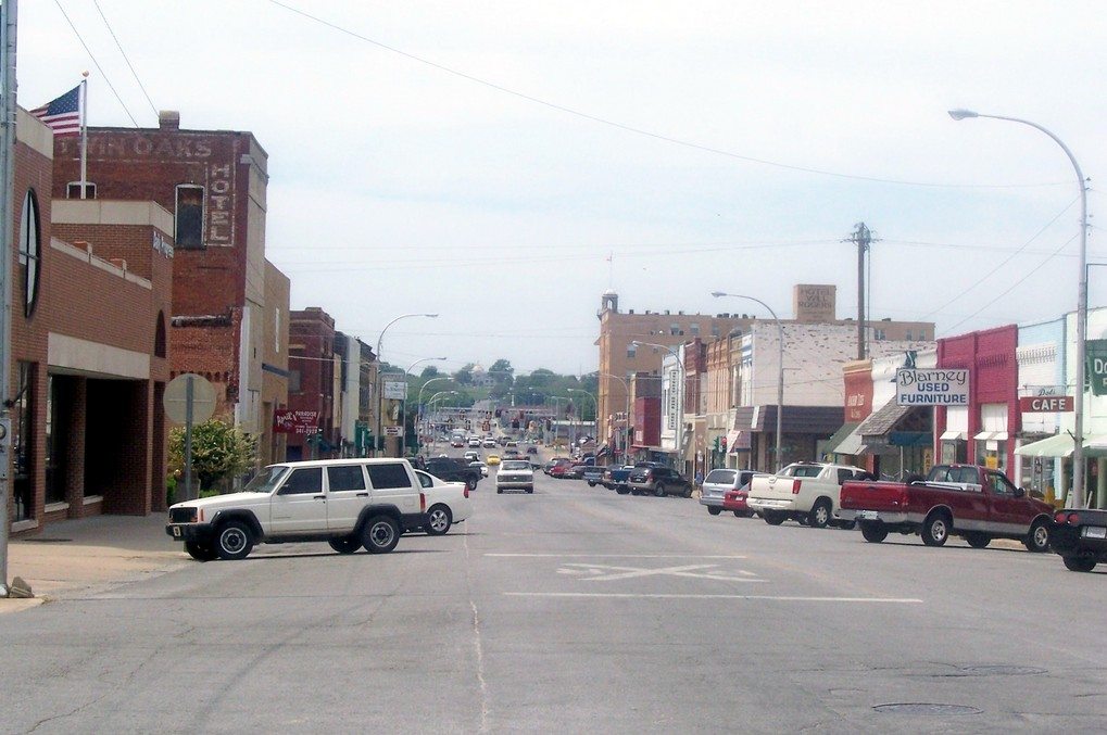
Anyway, here's something amusing to kill time for your last hour at work while I'm out drinking. The City of Claremore, which is essentially Tulsa's Guthrie, recently unveiled a new logo. We know this because of a very detailed and comprehensive report in the Tulsa World:
Claremore leaders like new city logo, marketing 'brand'
By RHETT MORGANA branding and marketing strategy a South Carolina company recommended for the city and other municipal organizations drew largely rave reviews from an audience that saw it for the first time Thursday night.
Ben Muldrow of Arnett Muldrow & Associates of Greenville, S.C., conducted the presentation before about 60 people at the Centennial Center at Rogers State University.
Unveiled was a community logo and graphic identities for all six partner organizations: the city, the Claremore Chamber of Commerce, the Claremore Convention and Visitors Bureau, the Claremore Industrial Economic Development Authority, Claremore Main Street, and the Innovation Center at Rogers State University.
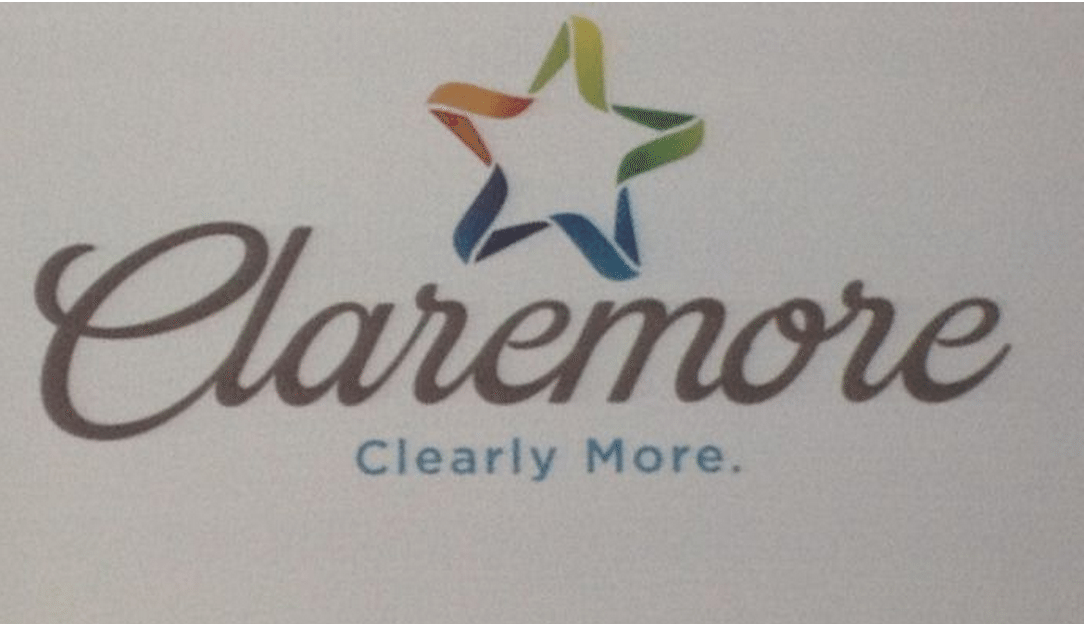
The community logo features a multicolored star above a script “Claremore” and a subhead that reads “Clearly More” in sans serif typeface.
“I am just as amazed as everyone,” said Tanya Andrews, executive director of the Convention and Visitors Bureau. “He (Muldrow) was able to capture our essence, our pride, our community.”
The logo captures the essence and pride of the Claremore community? Does that mean it makes you want to leave Claremore for a better life?
Andrews said the six sponsoring partners paid a total of $17,500 for the work, which was completed in two days and included a branding statement and mock-ups for advertising and signage.
“What he has done for Visit Claremore is given us new opportunities, new ways to share our message with the world,” she said. “Some of the ideas he has given us are incredible. We’re really excited that we can play with the logo and color variations. The design has opened up a whole new sector for us.”
Examples of the advertising included “Clearly Academic” for images and text for Rogers State University and “Clearly Fashionable” for a clothing store.
Check it out:
Ha, some guy charged $17,500 for that logo!? Who does he think he is? Ackerman McQueen. Hell, I bet we would have sold them Fogzie for 10-grand.
The best part of this whole thing is the reaction from the Claremore City Manager. Instead of admitting they got ripped off, he tried to sell it as the greatest logo ever made. He's probably the same guy who left a status on Facebook praising the awful ending to True Detective:
“It’s powerful,” City Manager Jim Thomas said. “He was able to encapsulate the history in that mission statement that I’ve never seen from anybody in such a short time.
“He holds on to the tradition, but he also projects a positive image about our future, saying that our best days are still ahead. I am excited to work with what he has identified and work the other organizations. We’re going to communicate a good message to the people of Oklahoma. … I’m humbled and awestruck that in a short amount of time, he was able to get the pulse of the community.”
Yeah, he was able to get the pulse of the community figured out. All $17,500 of it, to be exact.